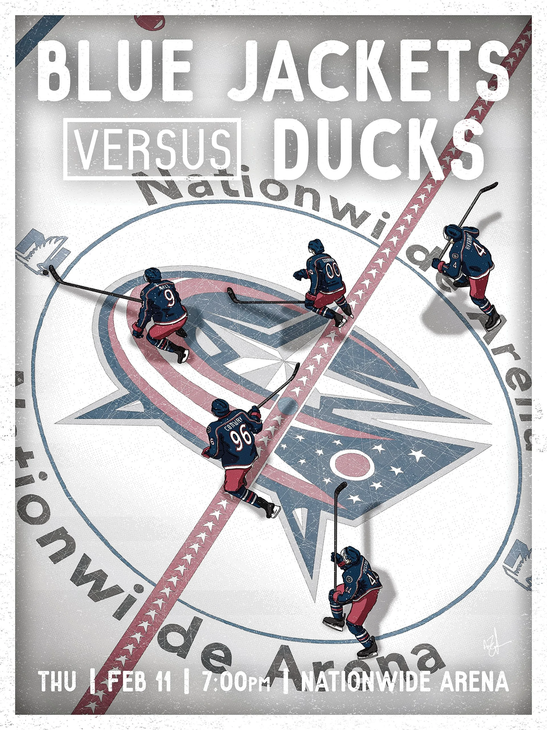
Columbus Blue Jackets
This poster series was created to tell micro-stories around the Columbus Blue Jackets beyond traditional game promotion. Each illustration focused on a different emotional or narrative angle, such as player identity, rivalry, momentum, or symbolic moments, designed to engage fans in a way that felt more expressive than standard photography-led advertising.
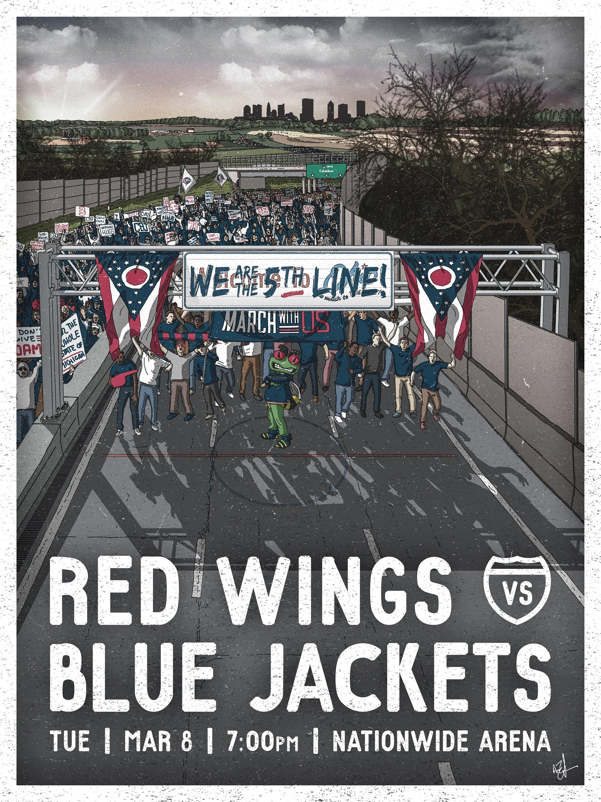
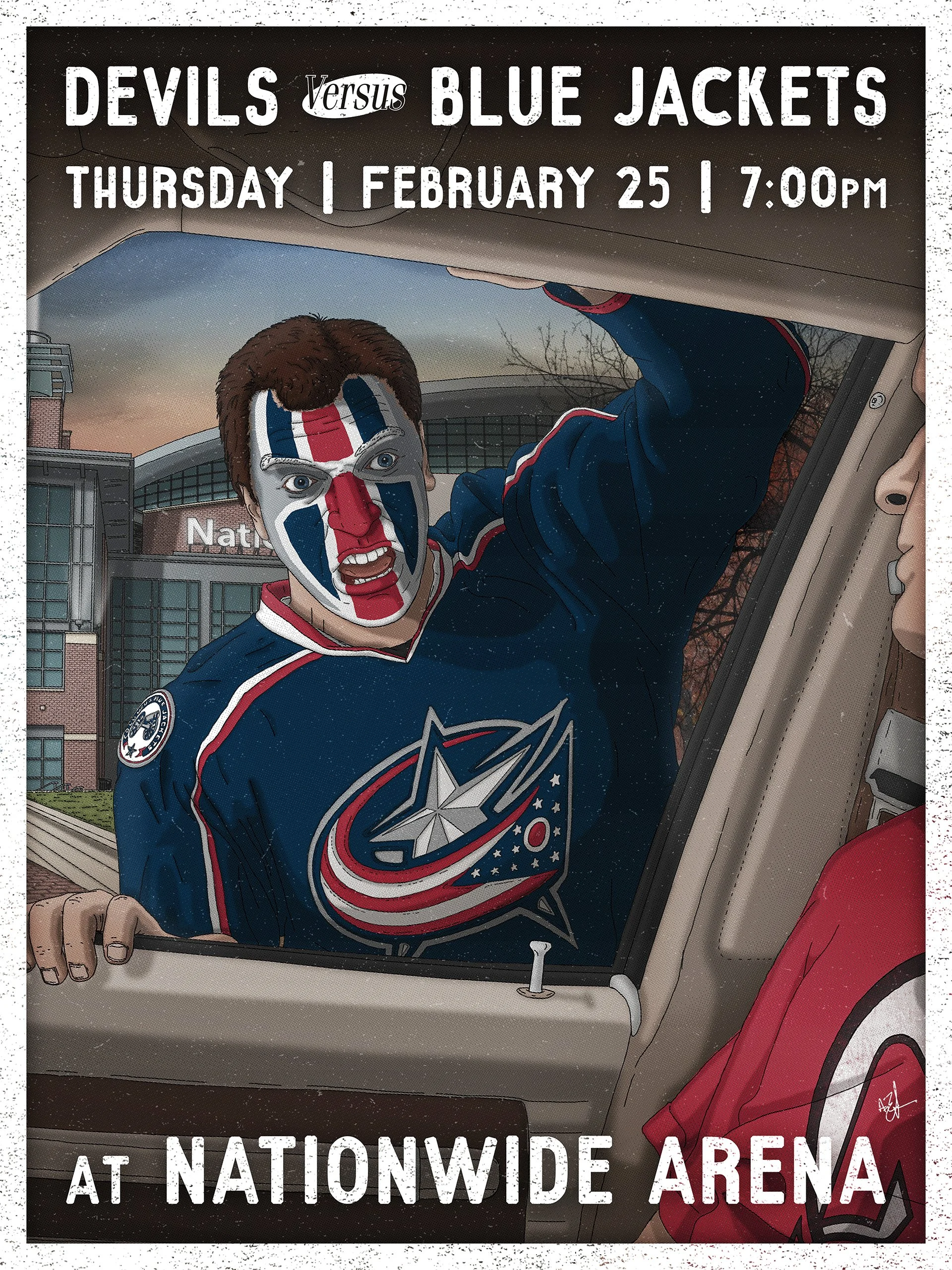
Rivalry & Tension
This set approaches rivalry through tone and context rather than confrontation. Instead of amplifying opposition directly, each poster builds atmosphere around the matchup, using environmental tension, civic pride, and humor to frame the story of the game.
Rivalry becomes a lens rather than a weapon. State-level history, regional identity, and emotional anticipation are translated into imagery that feels clever and composed instead of loud. The work respects the weight of the matchup while leaving space for interpretation, creating posters that spark conversation without relying on provocation.
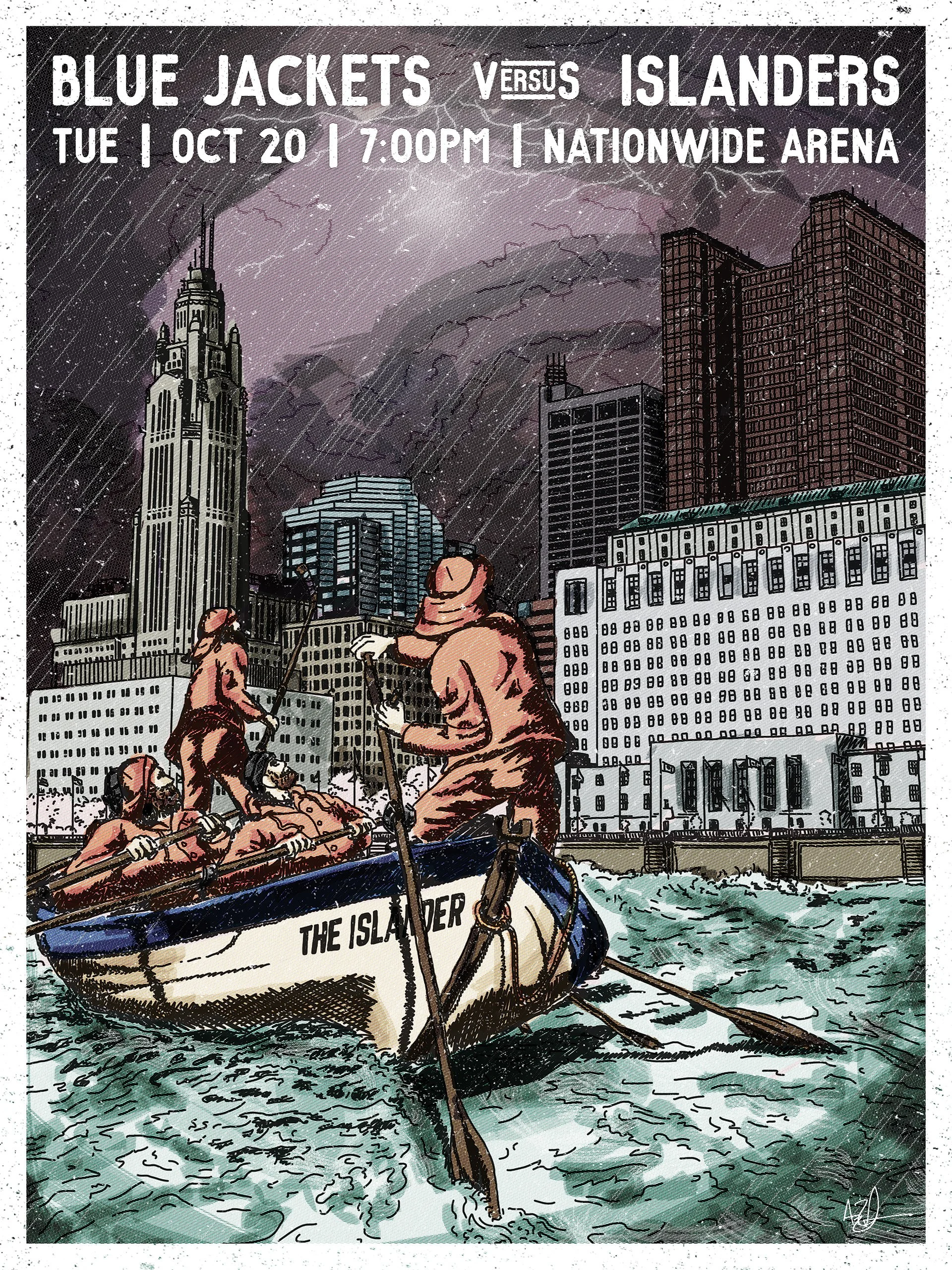
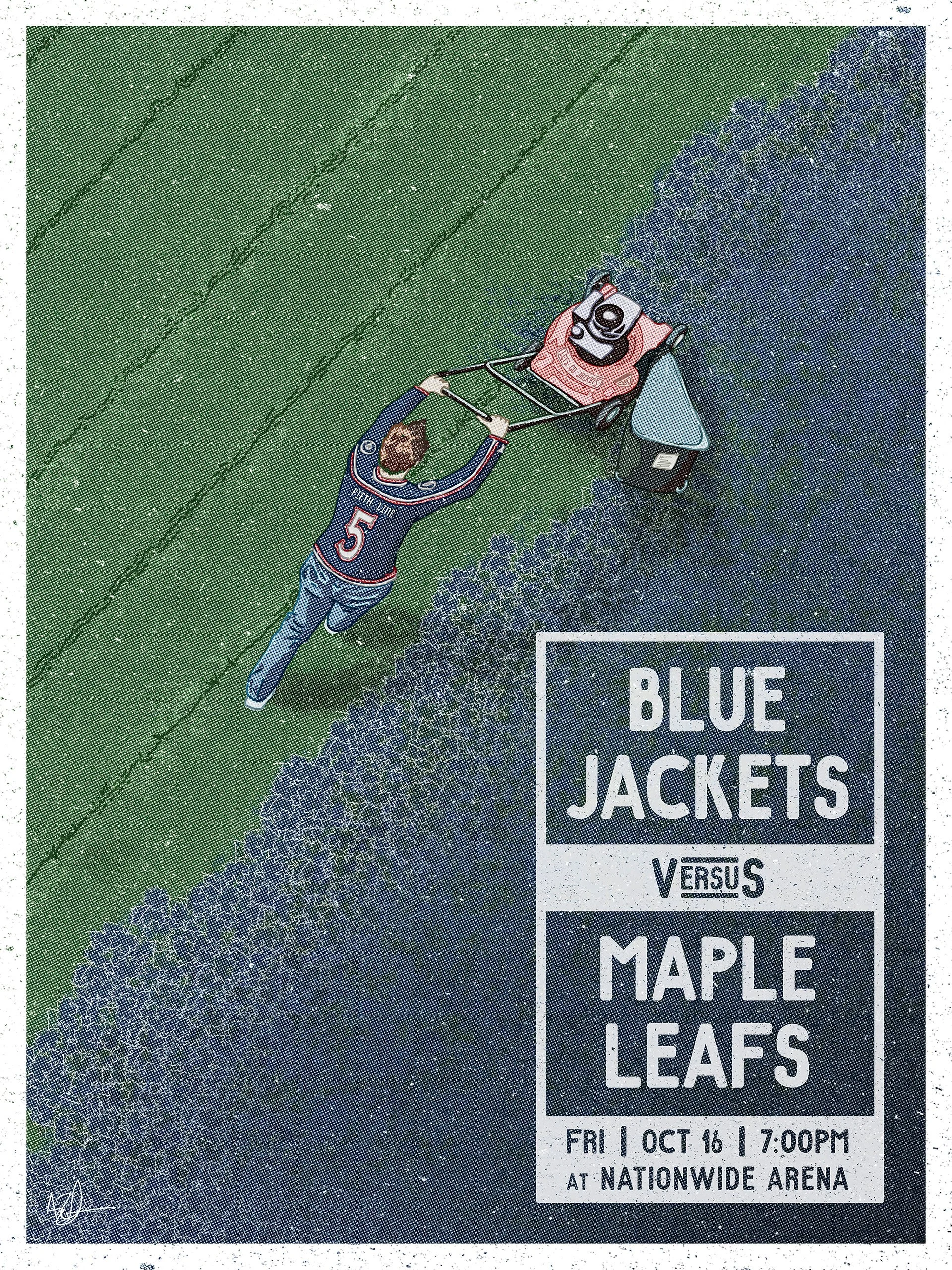
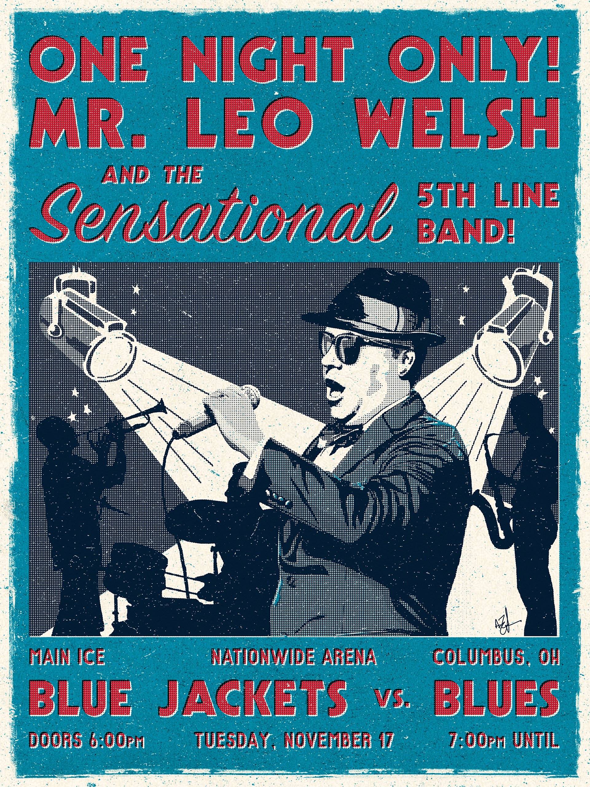
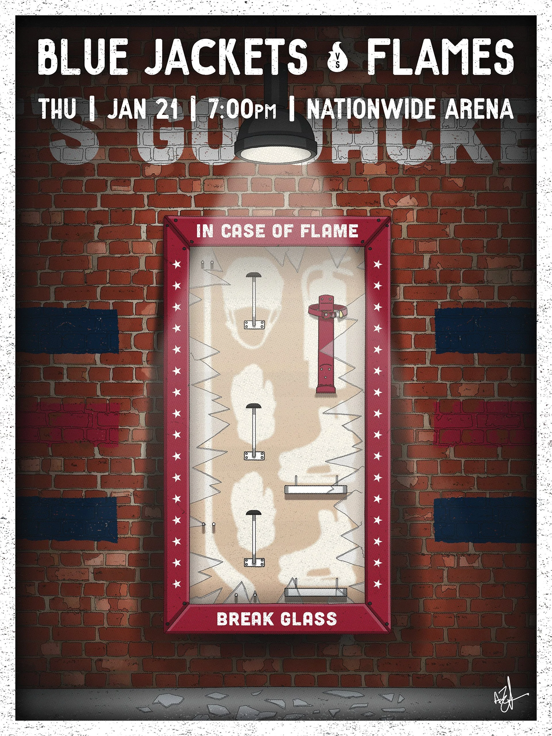
Visual Metaphor
This set of posters leans fully into metaphor as a storytelling device. Rather than illustrating the matchup directly, each piece builds a visual concept that allows the viewer to infer the narrative on their own. Opponent references are translated through seasonality, cultural touchstones, or environmental cues that turn familiar game-day language into something interpretive and unexpected.
These illustrations trust the audience to connect the dots. A fall lawn becomes a commentary on Toronto. A beloved anthem singer transforms into a blues musician. An empty emergency case implies the battle ahead. By removing literal depictions and focusing on conceptual clarity, the work creates moments that reward a second look and elevate what a standard game poster can be.
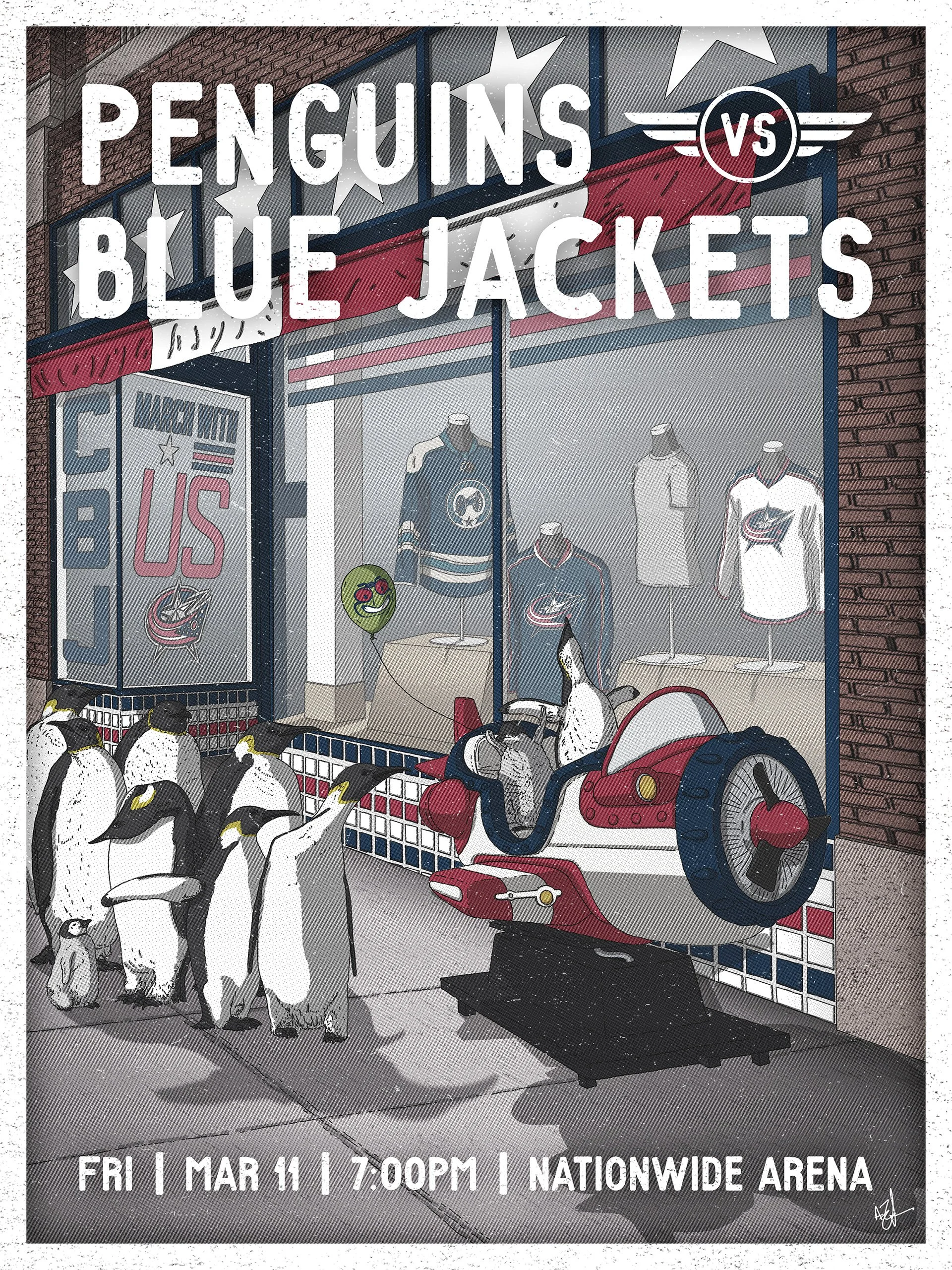
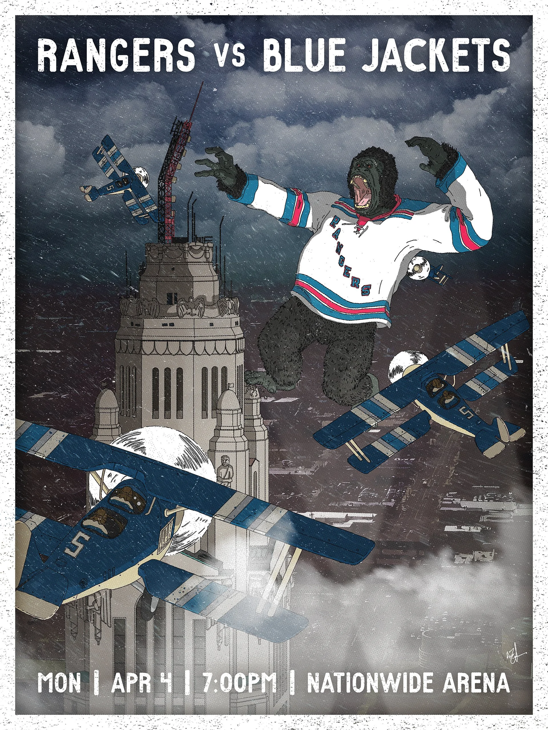
Pop Culture References
This set of posters draws from widely recognized film and television moments to create an immediate connection. Rather than subtle metaphors, these illustrations lean into shared cultural memory, depicting scenes and imagery that hockey fans can identify at a glance.
Whether recreating the Flying V from The Mighty Ducks, reimagining an iconic television outburst through a game-day lens, or borrowing cinematic scale to frame a matchup against New York, each piece uses familiar visual language as shorthand. The goal was to tap into nostalgia and collective recognition to help turn a single regular-season game into something that felt larger, more theatrical, and culturally rooted.
Series Reflection
Over the course of the 2014–15 NHL season, this series grew into 41 illustrated game-day posters… One for every home matchup. Produced alongside day-to-day responsibilities, the work evolved into a consistent visual system that treated each game as its own narrative opportunity.
At the time, illustration was rarely used as the primary voice for sports marketing, particularly without relying on player photography or literal game imagery. The series gained recognition beyond Columbus, earning features in national outlets and helping establish illustrated game-day posters as a viable storytelling format in professional sports.
What began as an experiment in visual storytelling became a season-long exploration of tone, metaphor, and cultural language. It served as proof that every single regular-season game can carry its own narrative weight.