2024 NHL Winter Classic
Key Art + Breakaway Event Visual System
Art Direction, Design, Illustration
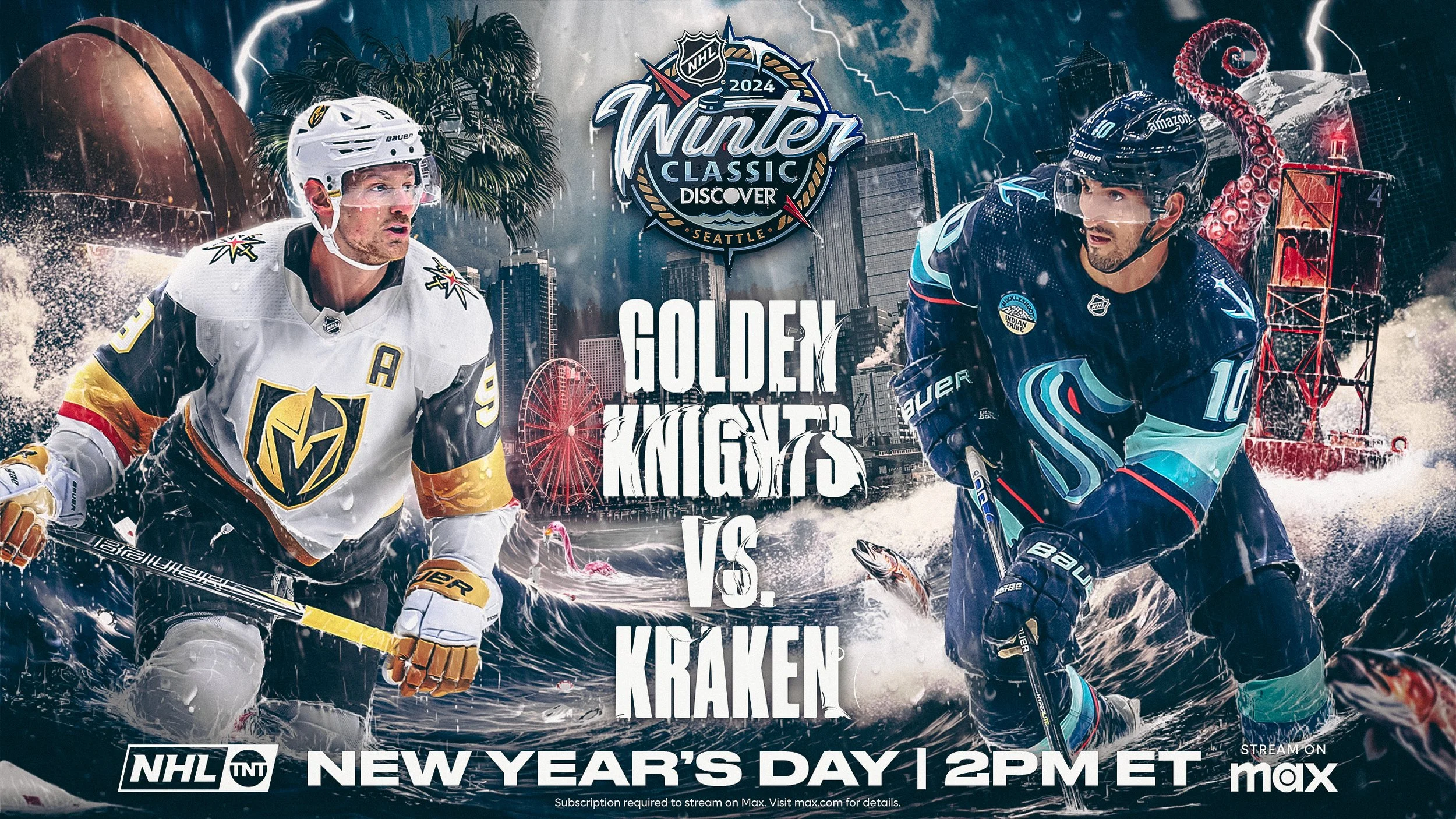
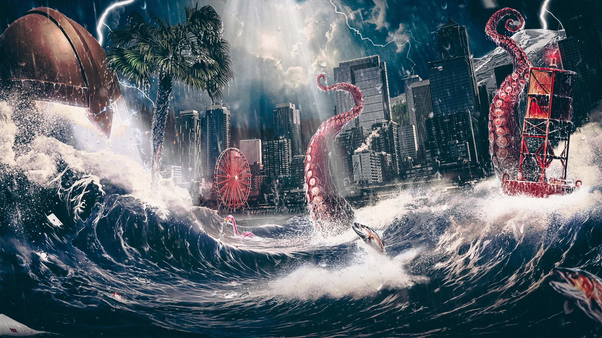
For the 2024 Winter Classic, instead of treating the key art as a static image, my approach was to transform the key art into a living environment. The campaign was designed to feel epic in scale, with Seattle defending its home water against the Vegas Golden Knights.
To help make the scene feel physically believable, I illustrated raindrops and droplets, water, light, and shadows. My goal was to make the scene not feel simply composited, even down to the droplets coming off of the visor and how they would react naturally to form, gravity, and motion of the players. I wanted to make the image feel alive even while completely still.
The composition weaves together visual references from both cities, such as Las Vegas / Golden Knights iconography embedded into the environment, and Pacific Northwest elements that anchor the scene in Seattle. The players and elements were presented oversized and angled toward each other to convey opposing forces moving through the Puget Sound rather than simply skating on ice.
The goal was to make sure the key art could match the energy of fandom and to create a system of graphics that respected both the city hosting the game and the fans experiencing it.

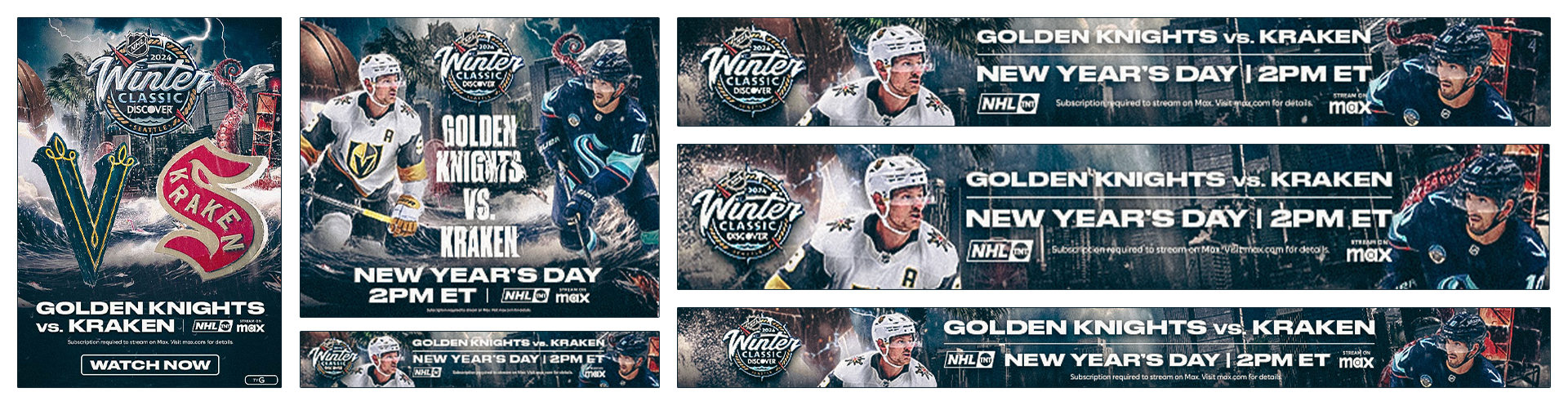
As soon as a direction is established, the approach immediately shifts from “key art image” to "how can this function as a system?" Large-scale events live across multiple formats, platforms, partners, departments, and timelines. With that reality in the back of my mind, every element introduced into the composition was done so with intent and flexibility baked in.
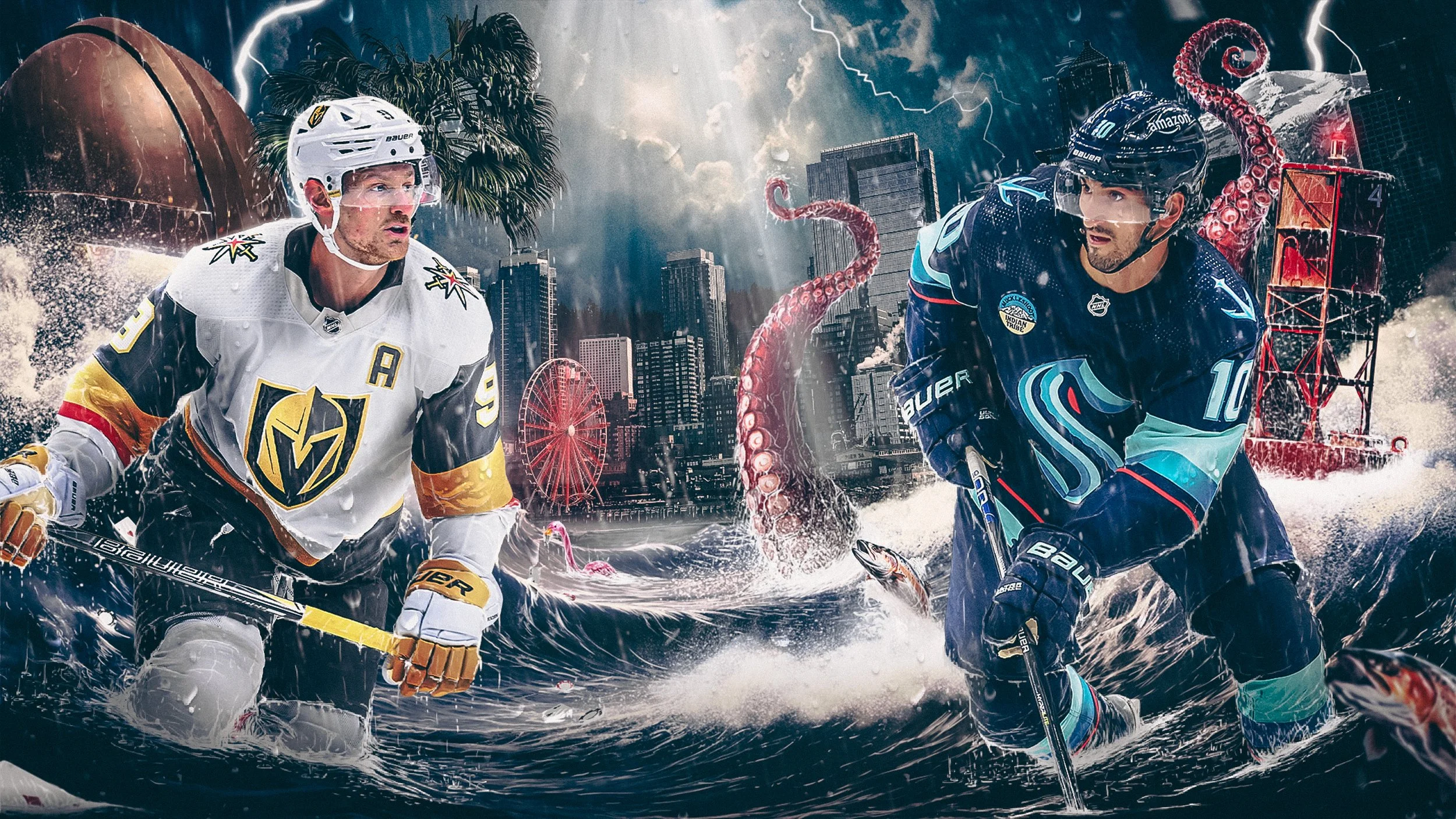
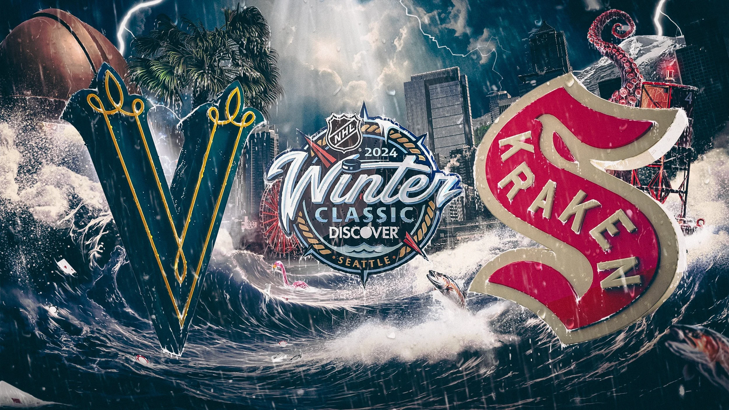
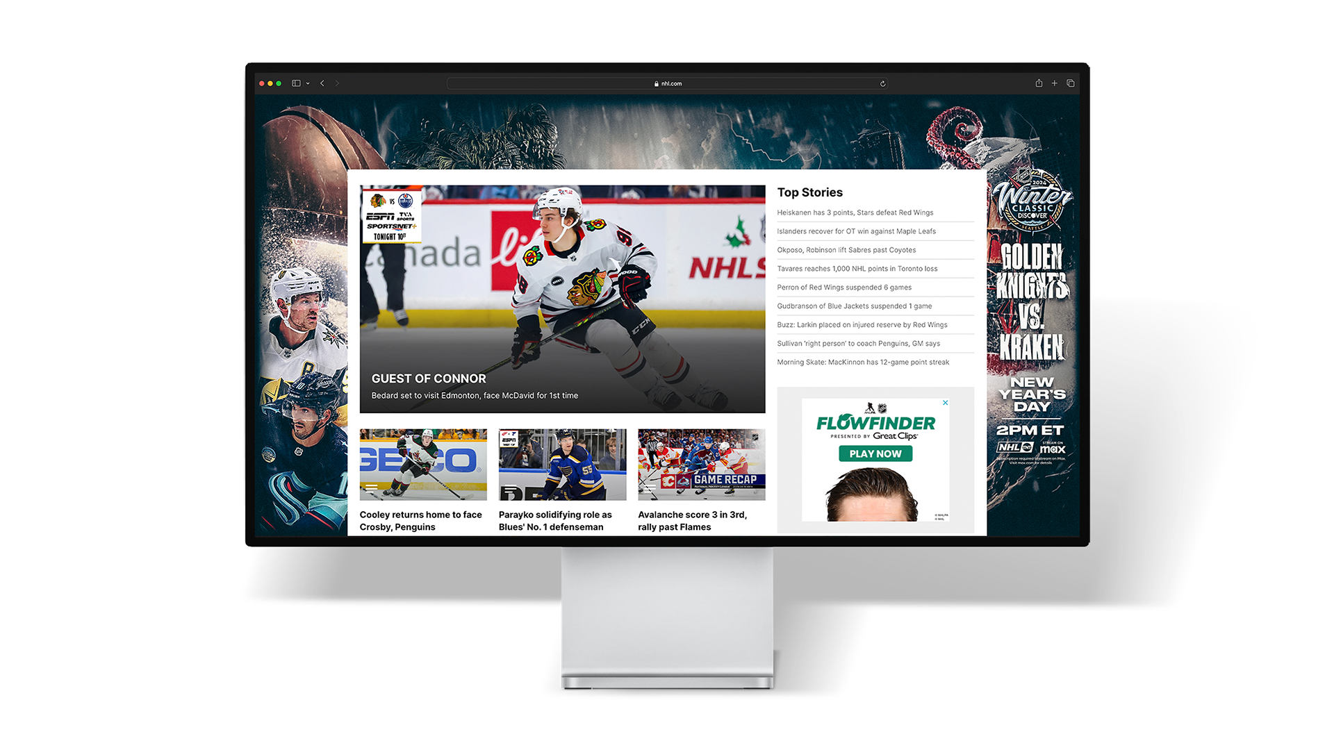
The final key art was built to function as a complete set of information across multiple sizes, while also supporting multiple levels of specificity. Key art for these events would typically require at least one player-driven version, a logo-based alternative, and one that was a fully stripped "generic" background. Each execution was planned from the start to ensure the system could remain intact even if details needed to change throughout the process.
In sports, one of your core rules must be designing with flexibility in mind. Assets needed buffer room, to be movable or removable, and nothing could rely on a single crop or context to make sense. The goal isn't just a system that's adaptable, but resilient. No matter where or how the art was displayed, the mood, balance, and intent were designed to hold.
Behind the scenes, with hundreds of assets produced across digital, physical, and environmental applications, working files needed to be accessible by multiple people. Within my files, every layer was named, grouped, color-coded, and documented. Instructions lived directly within the files as layers or named layer groups, and individual assets were broken out so partners with varying levels of experience could work confidently within the system.
I approach campaign work assuming the first use case will never be the last. Media landscapes branch, timelines compress, and needs change, and my role is to steward the visual language so it can flex without breaking.
Building the System

Adaptability and Scale
I designed the key art system to be able to adapt without losing the identity I was building. Whether featuring players, logos, or fully stripped imagery, each version needed to function as a complementary asset rather than a downgrade or secondary option.
The primary point of flexibility in the system was the subject itself. Each version was planned to coexist within the same framework, with negative space preserved at the center to accommodate information when required.
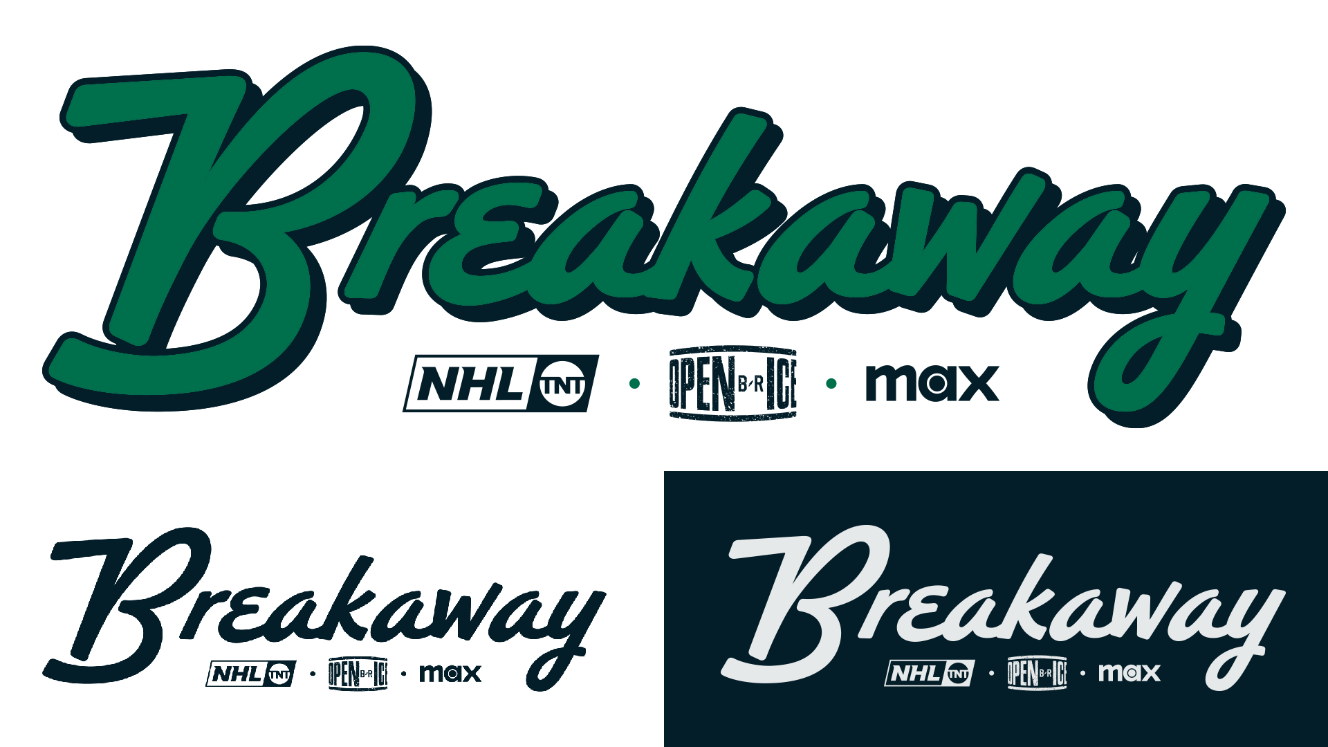
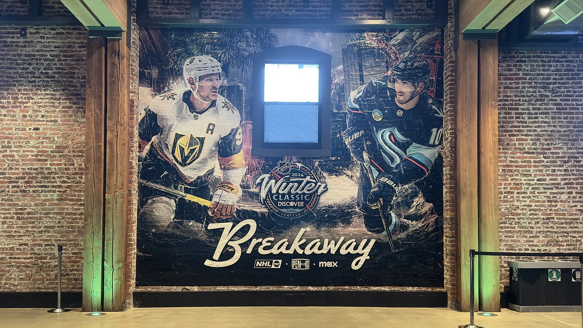
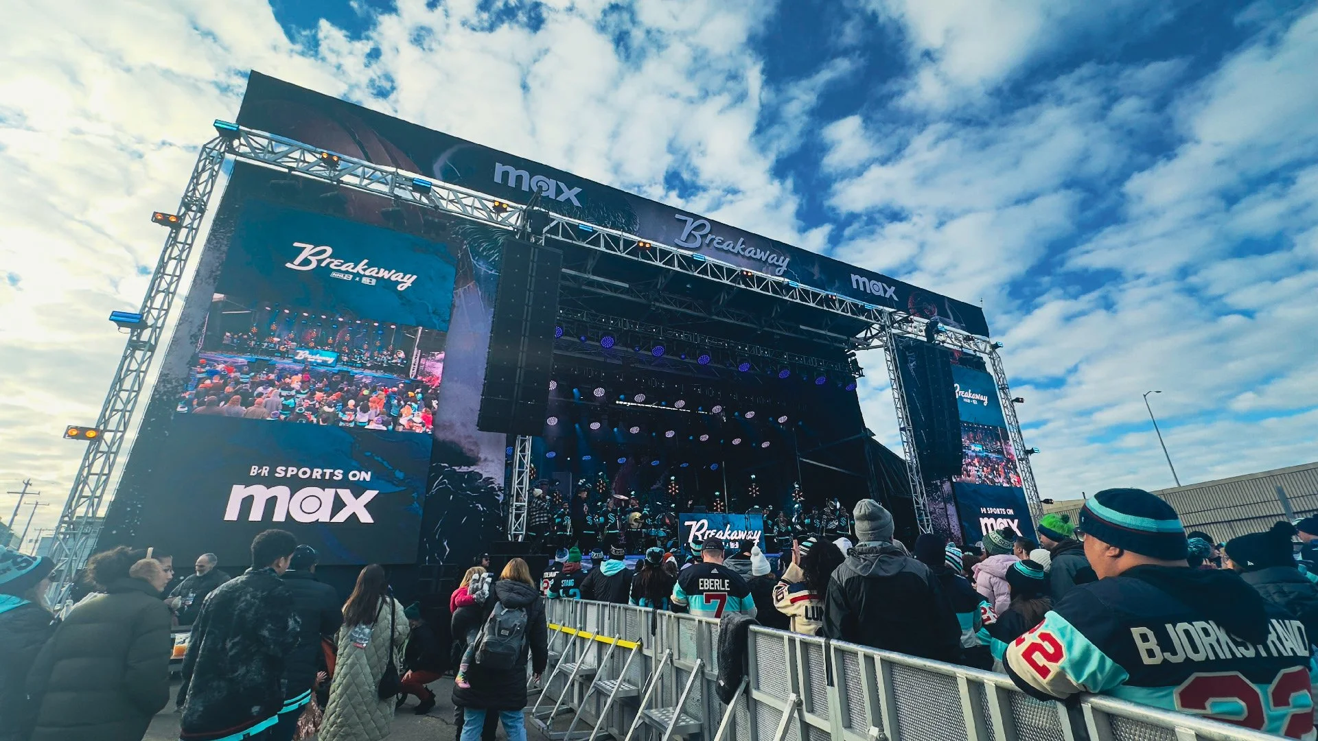
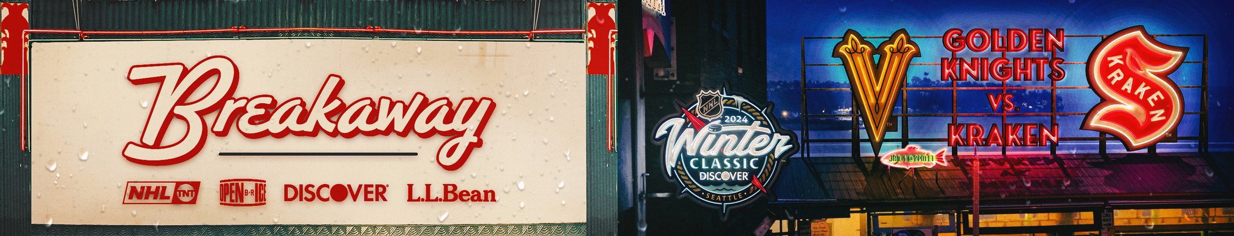
While the Winter Classic key art established the overarching tone, the Breakaway event called for a complementary system built specifically for the on-site experience. The branding leaned into atmosphere, texture, and regional cues, allowing the event to feel rooted in Seattle without relying on the event key art.
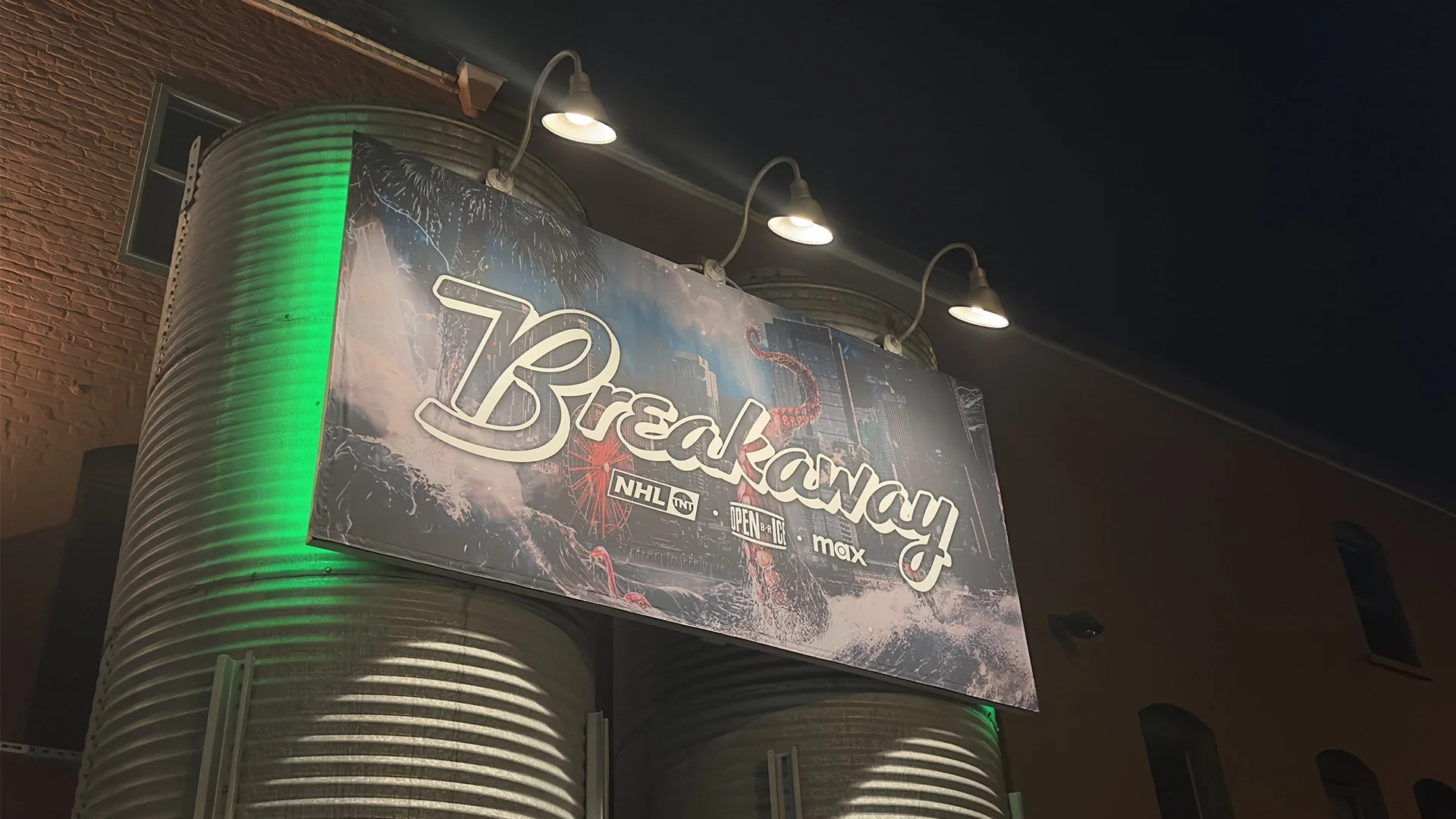
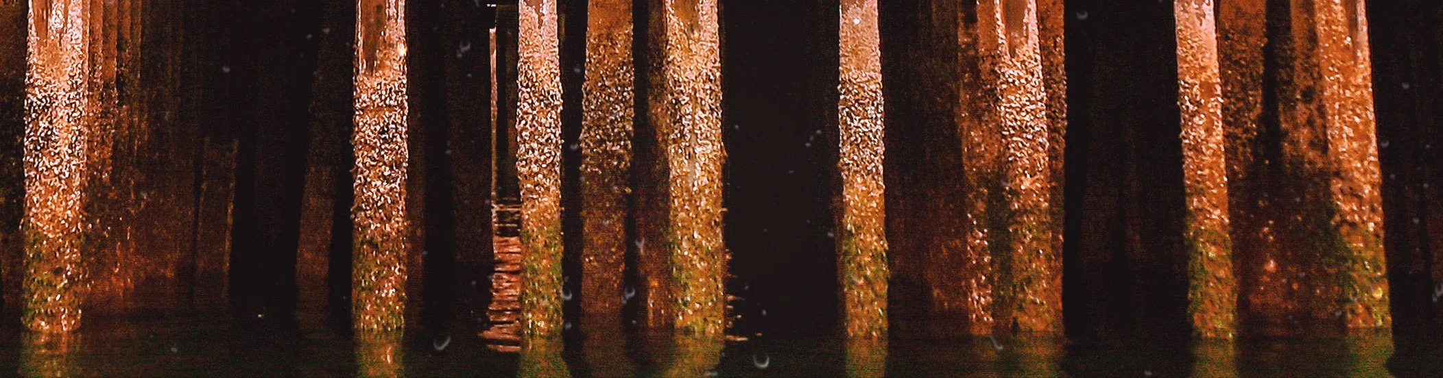
A rotating set of background imagery was developed to anchor the identity in place. I used the port and waterfront to reflect the city’s relationship with water, fog and dense forest textures to represent the surrounding landscape, and architectural details from Frank Gehry’s Experience Music Project to touch on the grunge and industrial edge tied to music culture in Seattle.
The Breakaway wordmark was designed to sit comfortably across both key art and environmental textures. This approach allowed the branding to scale naturally across fences, signage, and event surfaces, helping to add character to the event as it came to life.
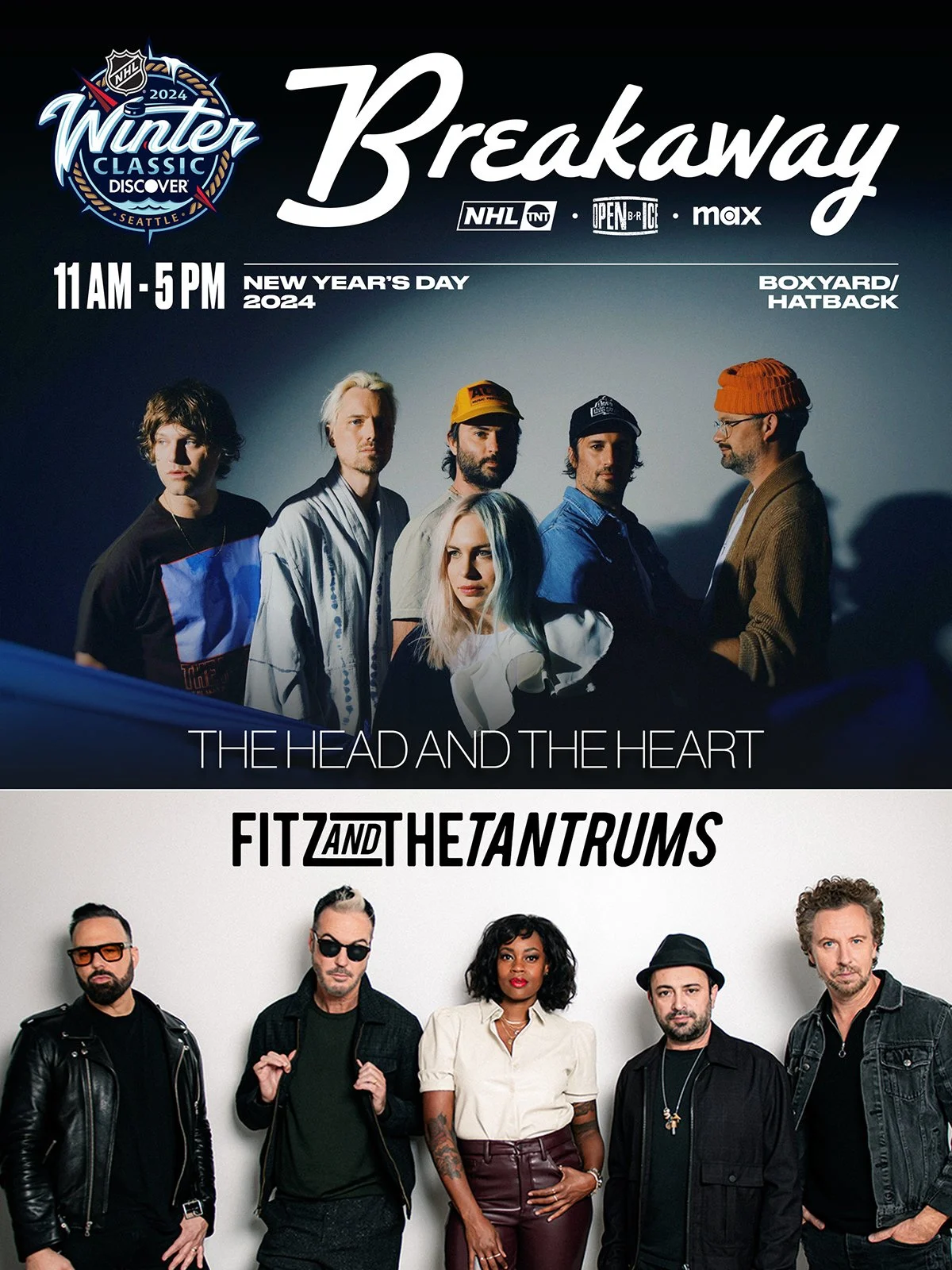
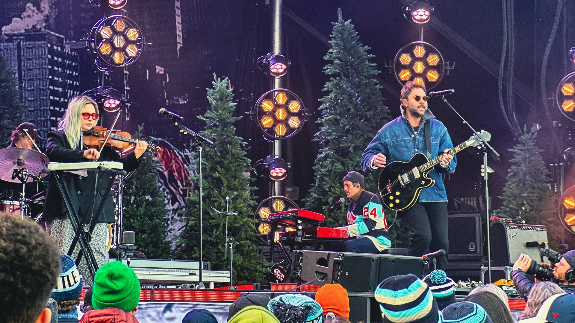
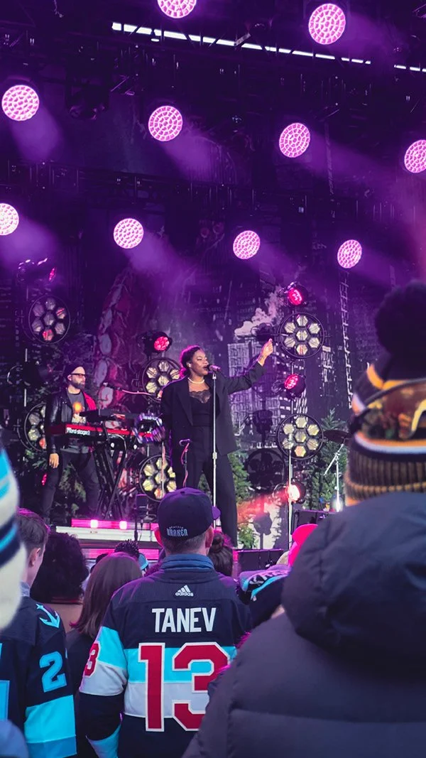
Breakaway: Extending the system


Beyond the Screen
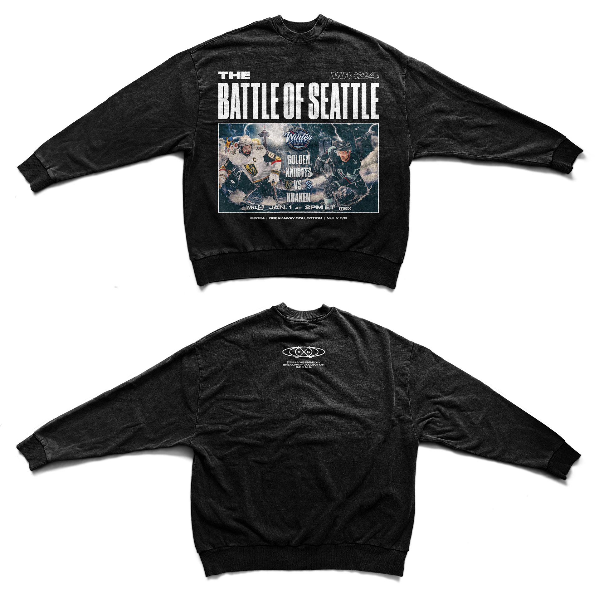
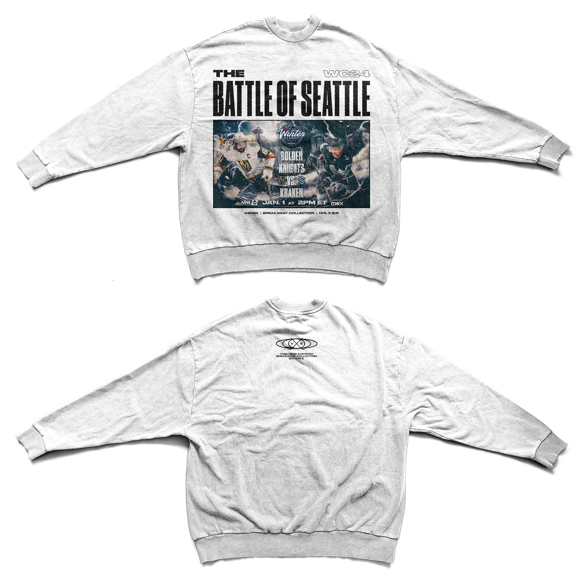
The visual system was ultimately brought to life in physical space by creating apparel and applying environmental branding to live music and on-site installations.