Showtime Networks
Social Brand Identity
Art Direction, Design
At the time, Showtime had a recognition problem. With the launch of Showtime’s own app, they felt that users had a recognition problem with the platform. They wanted a social presence that could hold an enormous content library together under one coherent brand, while also helping to make audiences actually associate the right content with Showtime.
Working with Malka Media, I developed a visual identity system for Showtime's social channels built around a single element already living in their logo: the red circle. The system gave the brand a flexible, scalable visual language that could work across past, present, and future programming without losing consistency.
Before I could pitch this to Showtime, I had left Malka for a role with the NHL, so the work here represents the concept and visual system as I developed it.
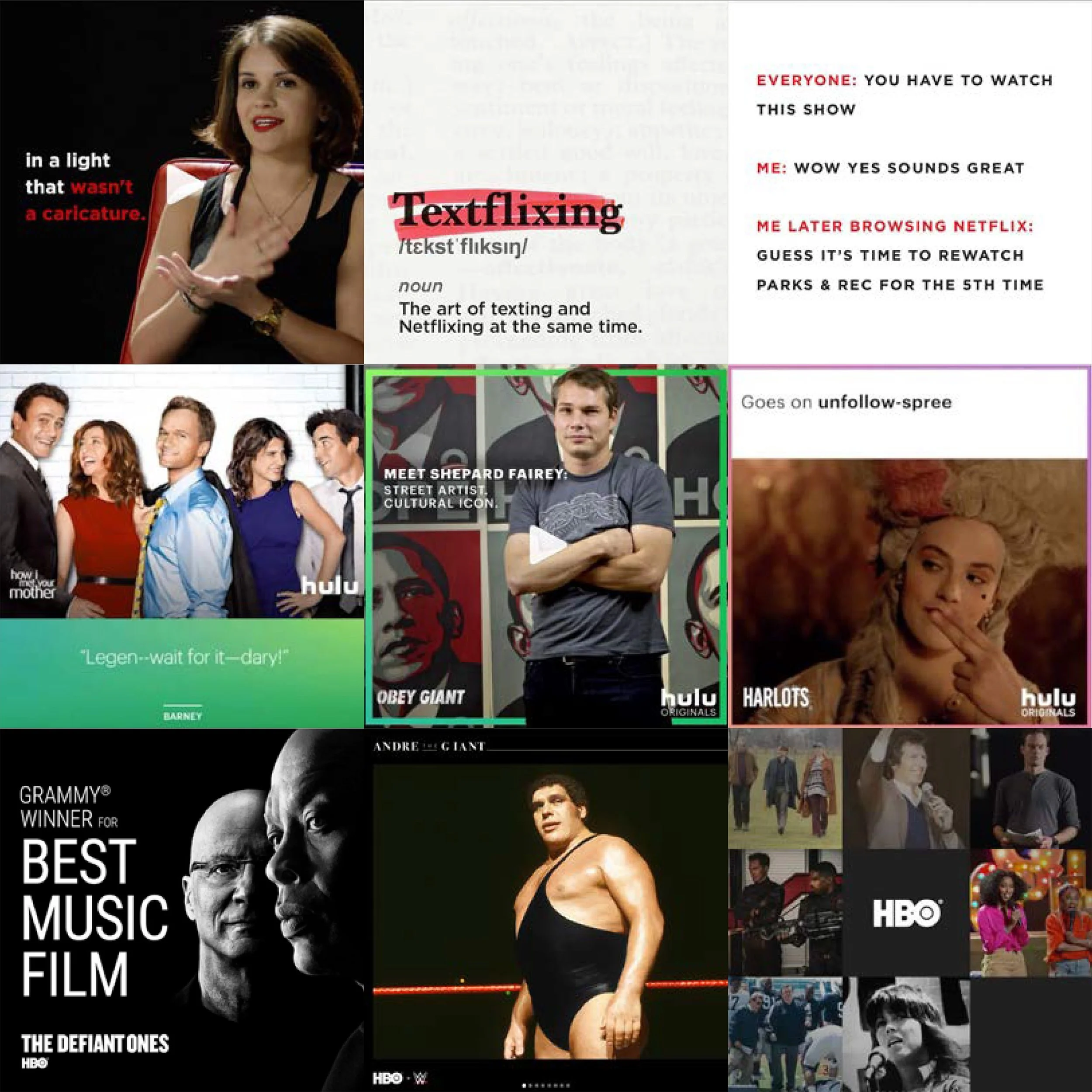
Before developing the system, we looked at how Netflix, Hulu, and HBO appeared on social media. Each had something Showtime was noting they lacked: a consistent, recognizable visual presence that made individual pieces of content feel like they belonged to the same brand. Minimal color palettes, clean design, and a repeatable brand feel meant you knew whose post you were looking at before you read a word in the post.
Showtime needed to meet the same bar.
The Inspiration
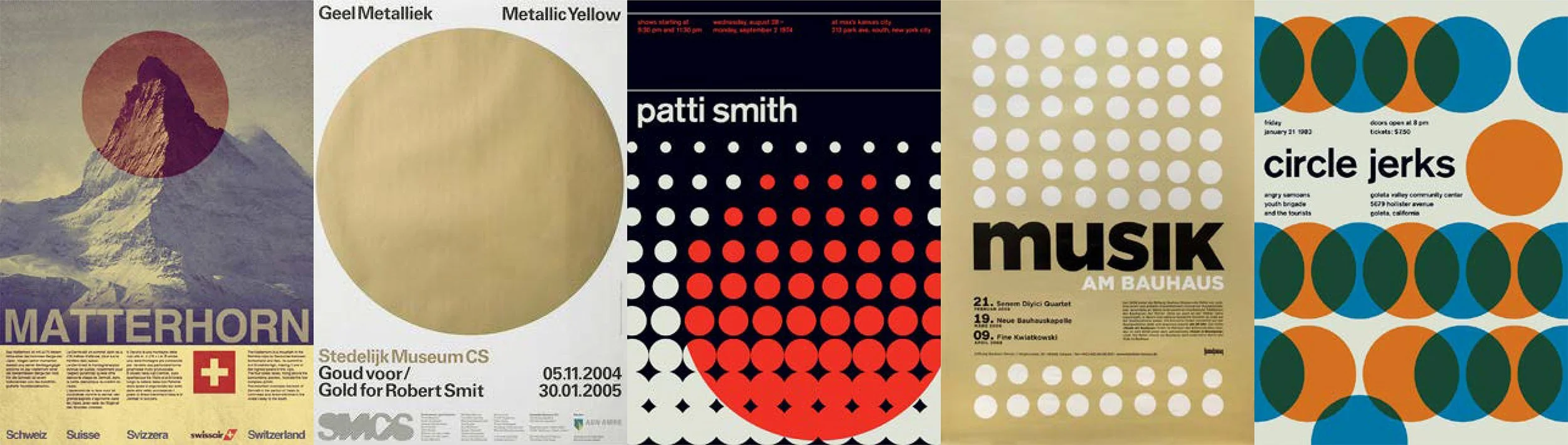
Showtime's problem was attribution and cohesion. Viewers couldn’t identify content as belonging to Showtime. With a Swiss design approach, the system was built around the kind of problem that Showtime was looking to solve: how do you create a unified look across content buckets without homogenizing the look? A strong grid structure, clean type, and a bold geometric element are what I felt could create instant recognizability for the brand, while still allowing room for content to breathe.
The approach
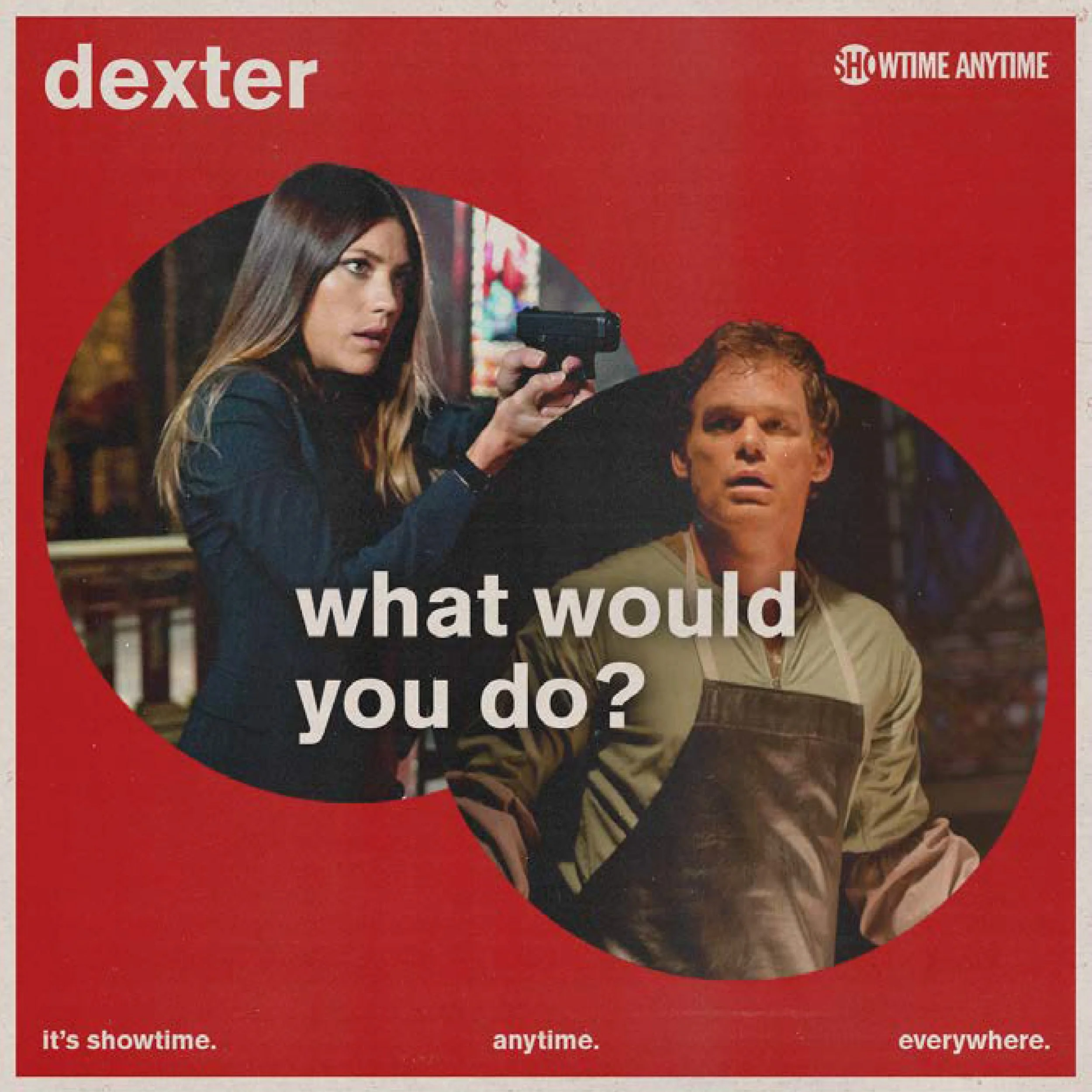
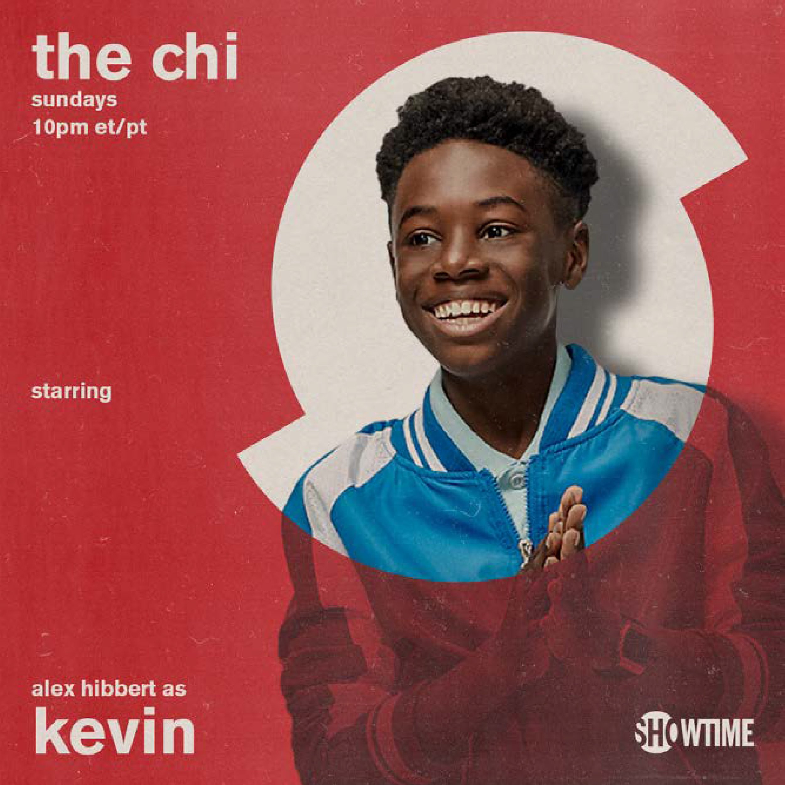
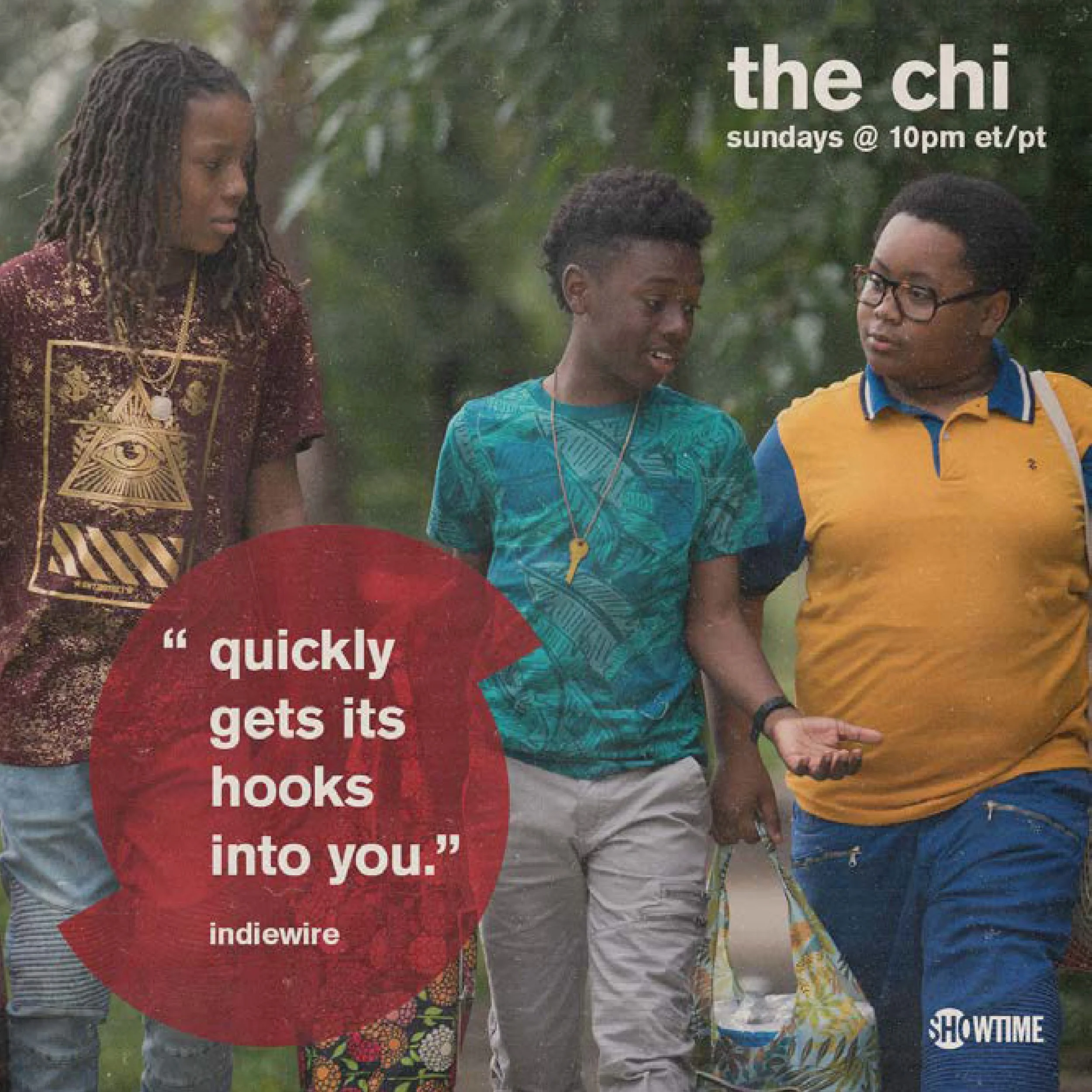
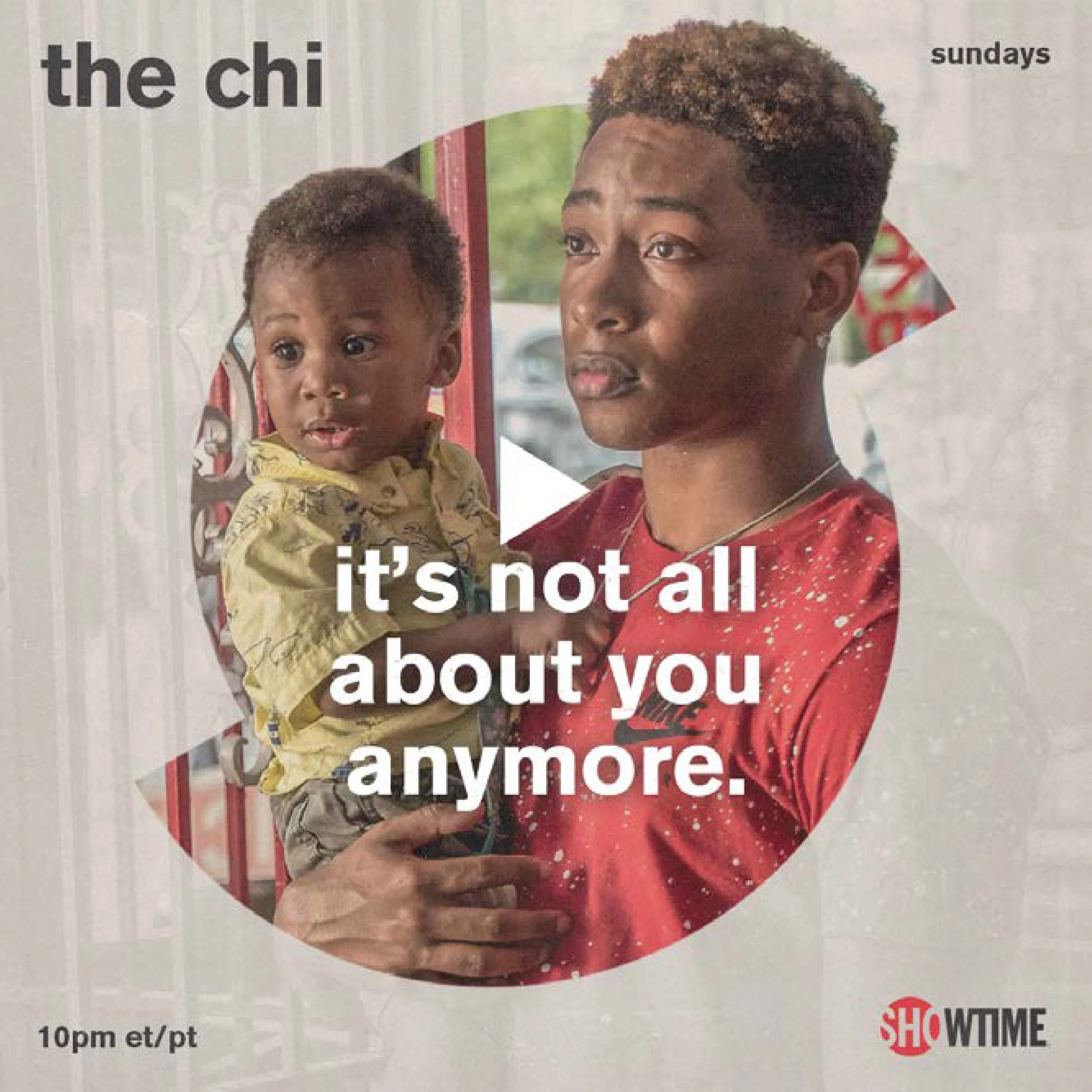
A bold, red circle was intended to showcase a visual constant that made every post feel like it belongs to the same family, regardless of which show it's featuring.
This red circle already existed in Showtime's logo. My approach was to isolate that circle and build the system around it. I didn’t want the look to be a departure from the brand. I was attempting to bring out something that I saw was already there.
Research
Then / now / next
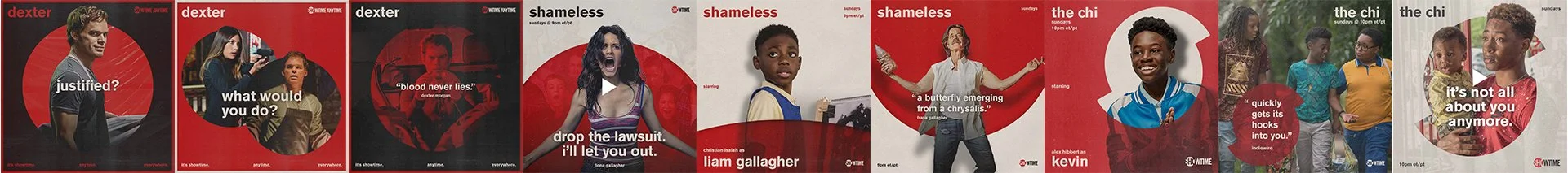
Showtime wanted the system to work across its entire content library of past shows, current programming, and upcoming releases. Each required a different approach to the red circle while staying visually cohesive.
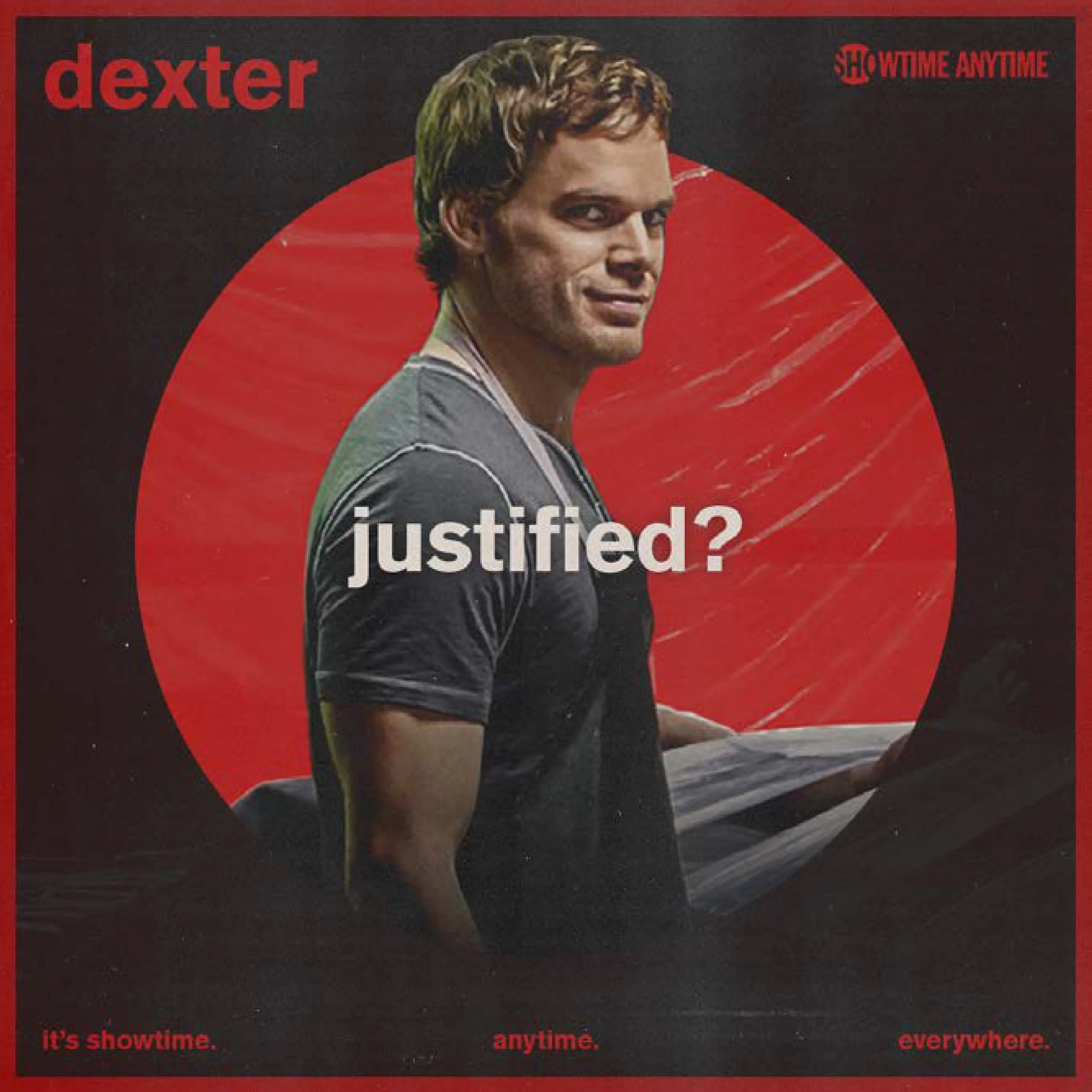
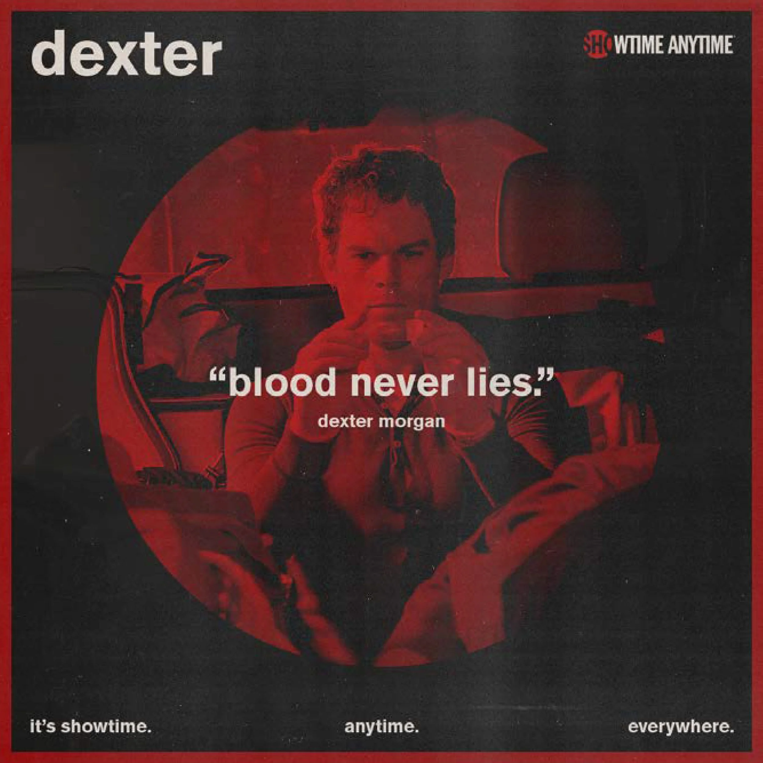
Then: For legacy programming, I wanted the red circle to become a container. A sort of window into the past.
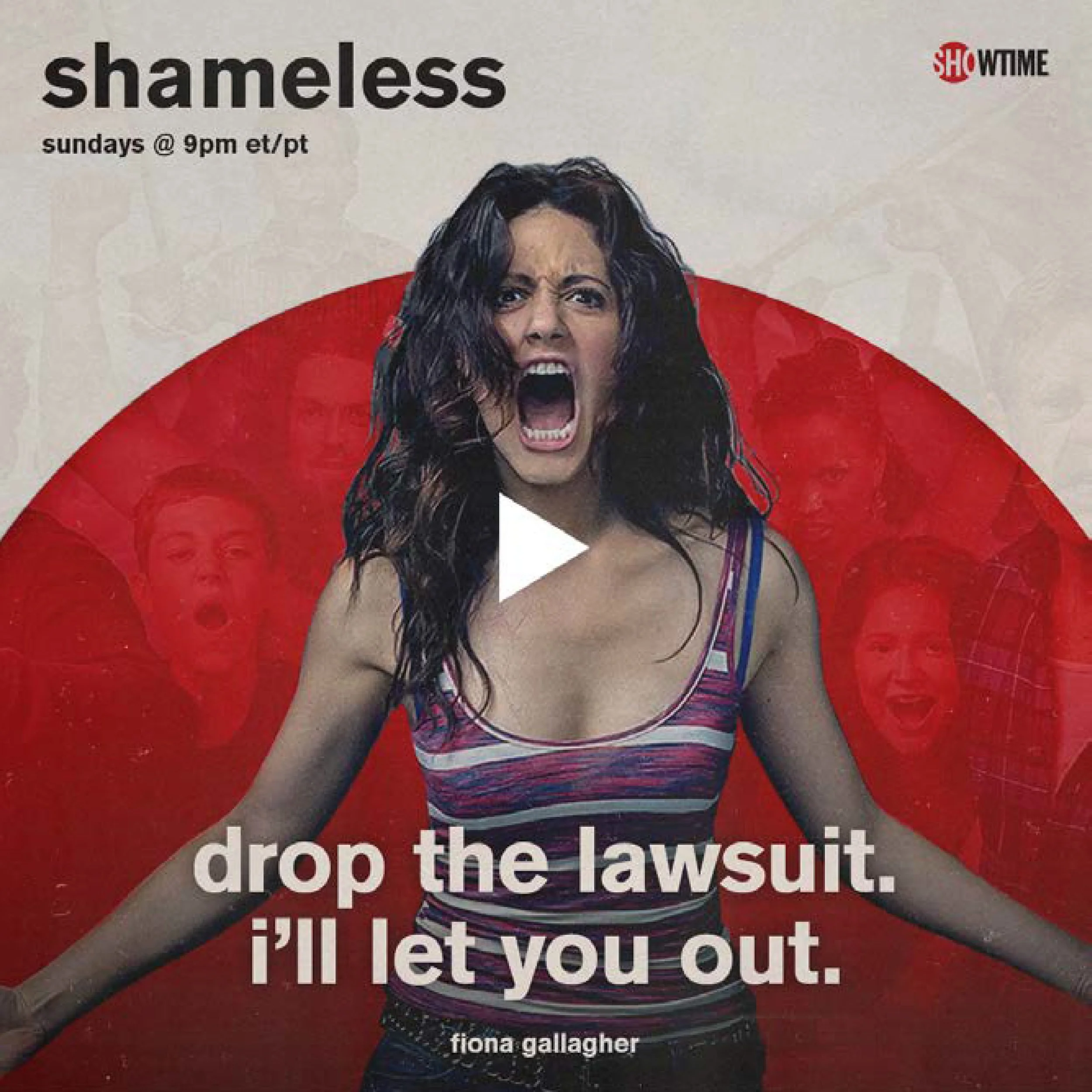
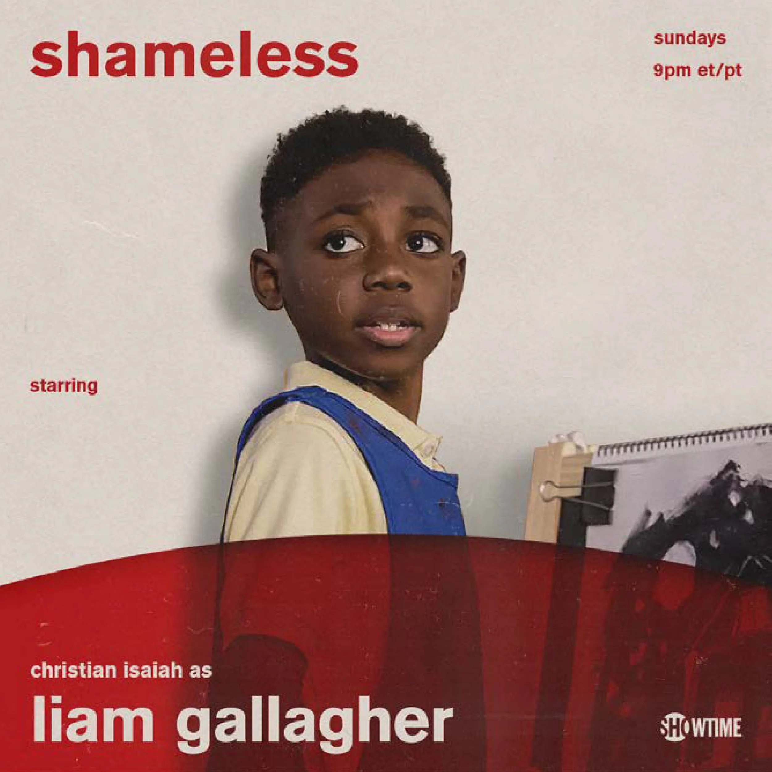
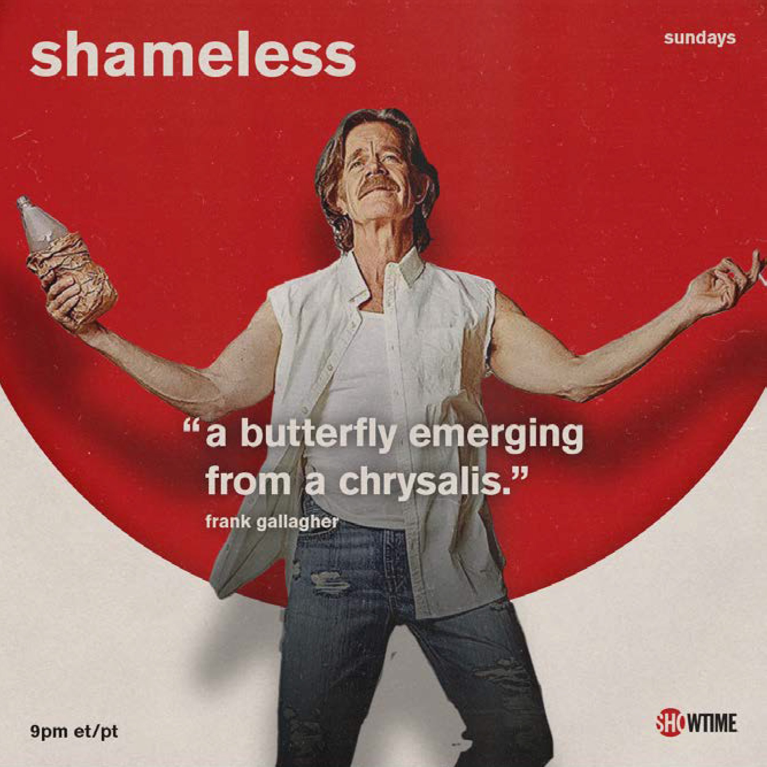
Now: For current programming, the circle moved from a container to the “stage.” Characters break out of or are anchored by it, placing them in the present tense of the Showtime brand.
Next: For upcoming programming, the circle would transform entirely. Split and offset, it became an abstract "S" that signaled what's next while staying a part of the same visual system.